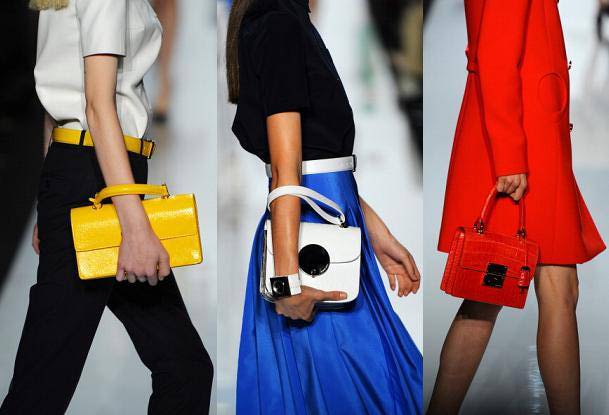
The Michael Kors Spring 2013 line presented a palette of brights. Here's my translation from fashion to home. This trend definitely introduces fun in a bold way. The colors are super saturated and that is a refreshing introduction.


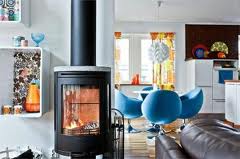
I love how the brights are used in an accentual way, but still shows the bravery of the dweller.

The depth created by painting the backs of these bookcases is dramatic and crisp.


I must say this color palette for Spring 2013 reminds me of a stack of Fiestaware.

Image Sources: Elle Decor, Pinterest, Fiestaware, House Beautiful, Decor Pad, House and Home, Michael Kors
I just love how you connect the two
ReplyDelete